SEIR: Initialising from incidence data
Source:vignettes/articles/SEIR-initialisation.Rmd
SEIR-initialisation.Rmd
library(diseasy)
#> Loading required package: diseasystore
#>
#> Attaching package: 'diseasy'
#> The following object is masked from 'package:diseasystore':
#>
#>     diseasyoption
Introduction
Let us begin by considering a general SEIR model with and consecutive and states respectively, which are governed by the rates and respectively.

SEIR model overview with multiple E and I states
Let us further assume that we have a incidence signal1, , which we would like our model to match.
The general approach is to consider the derivatives of the incidence and link these to the states of the model.
Initialising EI states
The states of the SEIR model should match the most recent developments of the incidence.
For this purpose, we assume that signal occurs when exiting in the model.
That is, we assume .
If we take the equation for and multiply by we obtain.
If we take the second derivative, we find: From here, we can inject from the SEIR equations which in turn relates to .
This process can be iterated through the derivatives until all states are expressed in terms of and its derivatives.
In this case, we can relate the states to the rates and derivatives of the signal in a simple form:
The matrix can be computed via a simple recursion.
To see why, start the equation for the derivative of :
And separating the and terms:
In the above formulation, this corresponds to the matrix .
When taking the second derivative, we obtain:
And separating the and terms:
Which, in the matrix formulation corresponds to the sum of and the shifted , where is the row vector of .
That is, we can express the second derivative as:
Which, combined with yields the two level system:
In general, the rows can be computed by recursion:
The algorithmic implementation of the recursion is then:
K <- 4
ri <- 0.9
re <- 0.8

M <- matrix(rep(0, K * (K + 1)), nrow = K) # Pre-allocate
active_row <- c(ri, 1)

for (k in seq(K)) {
  if (k > 1) active_row <- c(0, active_row) + re * c(active_row, 0)

  M[k, seq(k + 1)] <- active_row
}

M
#>        [,1] [,2] [,3] [,4] [,5]
#> [1,] 0.9000 1.00 0.00  0.0    0
#> [2,] 0.7200 1.70 1.00  0.0    0
#> [3,] 0.5760 2.08 2.50  1.0    0
#> [4,] 0.4608 2.24 4.08  3.3    1
Since we assume that the signal only relates to , then we can determine the states by evaluating the signal at .
Initialising SR states
The states of the SEIR model should capture both the short and the long term developments of the incidence signal we want to match. If a lot of infections have happened previously, we expect a larger proportion of the population to be in the states.
We again assume .
We can modify the SEIR equation to take this signal as a forcing function with one less state (no state).
The equations are as normal except for the following changes:
If we create such a submodel and start this system at a time where there are no new infections, we can initialize , and run the simulation forward to estimate the and populations at the point of interest.
Initialising custom model output states
When the model is asked to deliver a prediction for an observable, these observables may be shifted in time (i.e. delayed) relative to the point of infection.
For example, hospitalisation might occur on average 7 days after
infection. If the models starts at time = 0, then any model
output for hospitalisation will therefore have a transient period of 7
days before that signal begins being exported by the model.
Each model output is derived either from the state or any of the states added when the user defines a custom model output (see the “DiseasyModelOde” article).
To eliminate the transient behaviour of the model output when delays
are included, we can determine the values of the
state and the
states for time < 0.
This process is two-fold, 1) To determine
for time < 0 we can simply use the input signal given to
the initialisation method by re-using the assumption
.
- To determine
for
time < 0we use the same submodel used to infer the R and S states and configure the custom model outputs here. The forcing function in the submodel thus generates the time evolution of the states fortime < 0.
Testing the methods
We test the initialisation methods on a data set generated using the
same ?DiseasyModelOdeSeir model template that we are using
in this vignette.
Simple SEIR example data
For the first example, we use the SEIR model output where we know the parameters of the model used to generate the data.
To begin, we configure the observables module to use this data set and to use all available data.
# Connect to a database
obs <- DiseasyObservables$new(
  diseasystore = DiseasystoreSeirExample,
  conn = DBI::dbConnect(duckdb::duckdb())
)

obs$set_study_period( # Use all available data
  start_date = obs$ds$min_start_date,
  end_date = obs$ds$max_end_date
)
The data set contains different data for the infected to test our initialisation method against.
The data are:
- “n_infected”: The true number of infected in the model, measured as
the number of people transitioning out of the
I1state at any given date. - “n_positive_simple”: A realisation of the number of test-positives in the model - using a 65 % probability of testing.
- “n_positive”: A realisation of the number of test-positives in the model - using a overall 65 % probability of testing in conjunction with a reduced probability of testing during weekends.
model_data <- c("n_infected", "n_positive_simple", "n_positive") |>
  purrr::map(\(observable) {
    obs$get_observation(
      observable = observable,
      stratification = rlang::quos(age_group)
    )
  }) |>
  purrr::reduce(~ dplyr::full_join(.x, .y, by = c("date", "age_group"))) |>
  dplyr::mutate("variant" = "WT", .after = "age_group")

model_data
#> # A tibble: 1,500 × 6
#>    date       age_group variant n_infected n_positive_simple n_positive
#>    <date>     <chr>     <chr>        <dbl>             <dbl>      <dbl>
#>  1 2020-01-03 00-29     WT            68.0                42         42
#>  2 2020-01-04 00-29     WT           145.                 94         69
#>  3 2020-01-05 00-29     WT           191.                122         93
#>  4 2020-01-06 00-29     WT           220.                142        149
#>  5 2020-01-07 00-29     WT           242.                152        163
#>  6 2020-01-08 00-29     WT           265.                169        180
#>  7 2020-01-09 00-29     WT           289.                189        203
#>  8 2020-01-10 00-29     WT           315.                191        207
#>  9 2020-01-11 00-29     WT           343.                231        176
#> 10 2020-01-12 00-29     WT           374.                236        174
#> # ℹ 1,490 more rows
# Visualise the example data
ggplot2::ggplot(model_data) +
  ggplot2::geom_line(
    ggplot2::aes(x = date, y = n_infected, color = "Infected"),
    linewidth = 1
  ) +
  ggplot2::geom_point(
    ggplot2::aes(x = date, y = n_positive, color = "Test positive (realistic)")
  ) +
  ggplot2::geom_line(
    ggplot2::aes(
      x = date, y = n_positive_simple,
      color = "Test positive (simple)"
    ),
    linewidth = 1
  ) +
  ggplot2::facet_wrap(~ age_group) +
  ggplot2::ylab("Test positive / Infected") +
  ggplot2::scale_color_manual(
    values = c(
      "Infected"                  = "deepskyblue3",
      "Test positive (simple)"    = "orange",
      "Test positive (realistic)" = "seagreen"
    )
  ) +
  ggplot2::labs(colour = "Model output")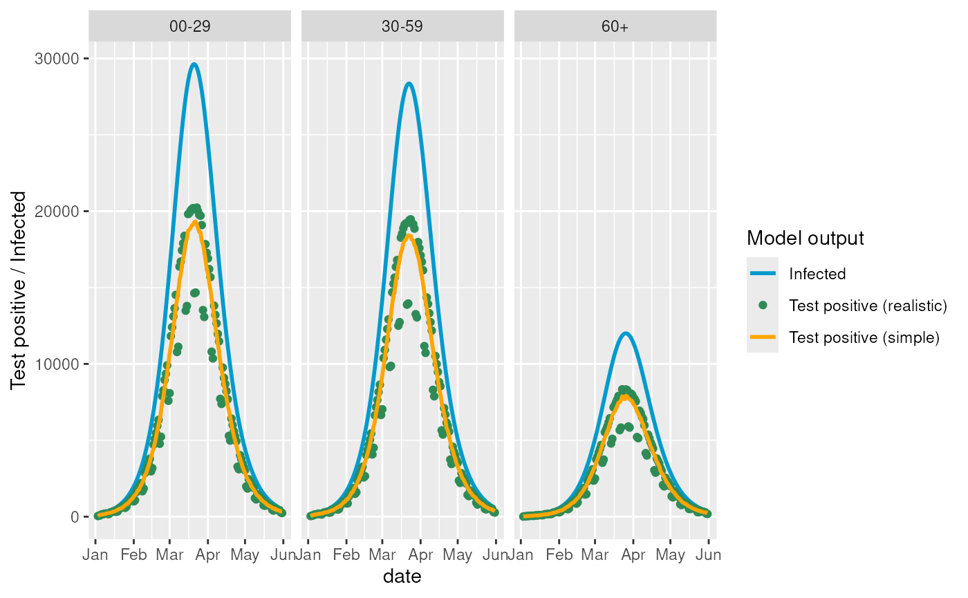
These different levels of detail allows us to test the initialisation from incidence data in different cases.
The method relies on having incidence data, so we scale the model outputs by the population size. We do this by creating a “synthetic” observable in the observables module.
The simplest cases is using the “n_infected” signal which directly
tracks the I1 state in the model. While the most realistic
case is the “n_positive” signal which has some real life inspired noise
patterns.
source <- "n_positive"


if (source == "n_infected") {
  mapping <- \(n_infected, n_population) n_infected / (n_population)
} else if (source == "n_positive_simple") {
  mapping <- \(n_positive_simple, n_population) {
    n_positive_simple / (n_population * 0.65)
  }
} else if (source == "n_positive") {
  mapping <- \(n_positive, n_population) n_positive / (n_population * 0.65)
}

obs$define_synthetic_observable("incidence", mapping)

incidence_data <- obs$get_observation(
  observable = "incidence",
  stratification = rlang::quos(age_group)
) |>
  dplyr::mutate("source" = !!source)
Correctly specified model
In any case, we first need to define the model that should initialise using the incidence data. We here use the model configuration used to generate the data to test the best case scenario:
# Set the point in time to initialise from
obs$set_last_queryable_date(obs$start_date + lubridate::days(50))

generate_model <- function(K, L, M, rE = 1 / 2.1, rI = 1 / 4.5) {

  # Define the population for the model
  population <- DiseasyPopulation$new(age_cuts_lower = c(0, 30, 60))

  # Define the activity for the scenario
  activity <- DiseasyActivity$new()
  activity$set_contact_basis(contact_basis = contact_basis_nordic$DK)
  activity$set_activity_units(dk_activity_units)
  activity$change_activity(date = as.Date("1900-01-01"), opening = "baseline")

  # Add a waning immunity scenario
  immunity <- DiseasyImmunity$new()
  immunity$set_exponential_waning(time_scale = 180)

  # Add a season scenario
  season <- DiseasySeason$new()
  season$set_reference_date(as.Date("2020-01-20"))
  season$use_cosine_season()


  # Create a SEIR model to initialise
  m <- DiseasyModelOdeSeir$new(
    population = population,
    activity = activity,
    immunity = immunity,
    season = season,
    observables = obs,
    parameters = list(
      "compartment_structure" = c("E" = K, "I" = L, "R" = M),
      "overall_infection_risk" = 0.025,
      "disease_progression_rates" = c("E" = rE, "I" = rI)
    )
  )

  return(m)
}

m <- generate_model(2L, 1L, 2L) # Use the configuration from example data
This method relies on fitting a polynomial to the latest period, so we here visualise this fitting.
# Extract the most recent signal
poly_fit_data <- incidence_data |>
  dplyr::mutate(
    "t" = as.numeric(.data$date - !!obs$last_queryable_date, units = "days")
  )

poly_fit_projection <- poly_fit_data |>
  dplyr::group_by(.data$age_group) |>
  dplyr::group_modify(
    ~ {
      poly_fit <- lm(
        incidence ~ poly(t, m$parameters$incidence_polynomial_order, raw = TRUE),
        data = dplyr::filter(
          .x,
          .data$t <= 0,
          .data$t >= - m$parameters$incidence_polynomial_training_length
        )
      )

      tibble::tibble(
        "t" = .x$t,
        "incidence" = predict(poly_fit, data.frame("t" = t))
      ) |>
        dplyr::mutate("date" = .x$date)
    }
  )

incidence_data |>
  ggplot2::ggplot(ggplot2::aes(x = date, y = incidence)) +
    ggplot2::geom_point(
      color = switch(
        source,
        "n_infected"        = "deepskyblue3",
        "n_positive_simple" = "orange",
        "n_positive"        = "seagreen"
      )
    ) +
    ggplot2::geom_line(data = poly_fit_projection, color = "red", linewidth = 1) +
    ggplot2::geom_vline(
      xintercept = obs$last_queryable_date,
      linetype = 2, linewidth = 1, color = "red"
    ) +
    ggplot2::geom_vline(
      xintercept = obs$last_queryable_date -
        m$parameters$incidence_polynomial_training_length,
      linetype = 2, linewidth = 1, color = "red"
    ) +
    ggplot2::ylim(
      0,
      incidence_data |>
        dplyr::pull("incidence") |>
        max() * 1.1
    ) +
    ggplot2::facet_wrap(~ age_group) +
    ggplot2::theme_bw()
#> Warning: Removed 1241 rows containing missing values or values outside the scale range
#> (`geom_line()`).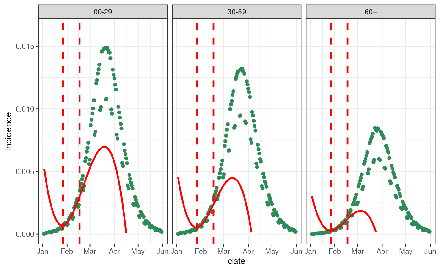
We can now use the
$initialise_state_vector() method to
infer the initial state vector.
psi <- m$initialise_state_vector(incidence_data)

psi
#> # A tibble: 168 × 5
#>     time variant age_group state   value
#>    <dbl> <chr>   <chr>     <chr>   <dbl>
#>  1     0 All     00-29     E1    0.00141
#>  2     0 All     00-29     E2    0.00139
#>  3     0 All     00-29     I1    0.00528
#>  4     0 All     00-29     R1    0.00131
#>  5     0 All     00-29     R2    0.00123
#>  6     0 All     30-59     E1    0.00121
#>  7     0 All     30-59     E2    0.00120
#>  8     0 All     30-59     I1    0.00457
#>  9     0 All     30-59     R1    0.00114
#> 10     0 All     30-59     R2    0.00107
#> # ℹ 158 more rows
And we now test the initial conditions by solving the model using these starting conditions.
prediction <- m$get_results(
  "incidence",
  stratification = rlang::quos(variant, age_group),
  prediction_length = 100
) |>
  dplyr::mutate(
    model_configuration = paste0(
      names(m$parameters$compartment_structure),
      m$parameters$compartment_structure,
      collapse = ""
    )
  )

prediction
#> # A tibble: 300 × 7
#>    date       variant age_group incidence realisation_id weight
#>    <date>     <chr>   <chr>         <dbl>          <dbl>  <dbl>
#>  1 2020-02-23 All     00-29       0.00343              1      1
#>  2 2020-02-24 All     00-29       0.00362              1      1
#>  3 2020-02-25 All     00-29       0.00385              1      1
#>  4 2020-02-26 All     00-29       0.00412              1      1
#>  5 2020-02-27 All     00-29       0.00440              1      1
#>  6 2020-02-28 All     00-29       0.00469              1      1
#>  7 2020-02-29 All     00-29       0.00500              1      1
#>  8 2020-03-01 All     00-29       0.00532              1      1
#>  9 2020-03-02 All     00-29       0.00564              1      1
#> 10 2020-03-03 All     00-29       0.00597              1      1
#> # ℹ 290 more rows
#> # ℹ 1 more variable: model_configuration <chr>
ggplot2::ggplot() +
  ggplot2::geom_point(
    data = incidence_data,
    ggplot2::aes(x = date, y = incidence),
    color = switch(
      source,
      "n_infected"        = "deepskyblue3",
      "n_positive_simple" = "orange",
      "n_positive"        = "seagreen"
    )
  ) +
  ggplot2::geom_line(
    data = prediction,
    ggplot2::aes(x = date, y = incidence, color = model_configuration),
    linewidth = 1.5
  ) +
  ggplot2::geom_vline(
    xintercept = obs$last_queryable_date,
    linetype = 2,
    color = "black"
  ) +
  ggplot2::facet_grid(source ~ age_group, scales = "free") +
  ggplot2::labs(y = "Model output", color = "Model Configuration")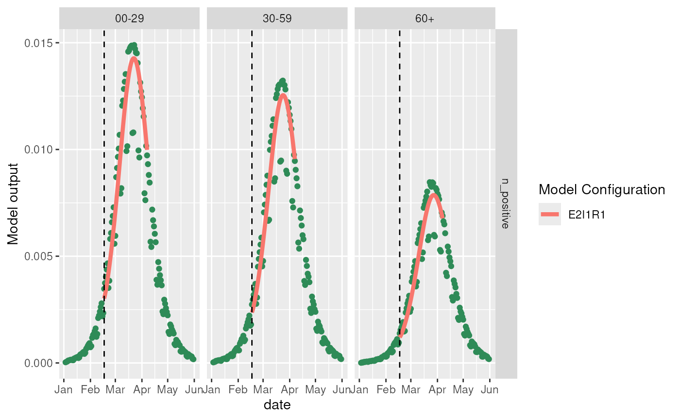
Misspecified model
Correctly matching the model is the best case scenario. However, we can also the method for a couple of cases where the model is misspecified.
Note that we at this state does not modify the parameters of the model to match the development, we only estimate the initial state vector.
Once we include model fitting, the discrepancy between the data and model predictions may diminish.
Misspecified model in periods of increasing infections
models <- list(
  generate_model(2L, 1L, 1L),
  generate_model(1L, 1L, 2L),
  generate_model(2L, 2L, 2L),
  generate_model(3L, 2L, 5L)
)

predictions <- models |>
  purrr::map(\(m) {
    m$get_results(
      "incidence",
      stratification = rlang::quos(variant, age_group),
      prediction_length = 100
    ) |>
      dplyr::mutate(
        model_configuration = paste0(
          names(m$parameters$compartment_structure),
          m$parameters$compartment_structure,
          collapse = ""
        )
  )
  }) |>
  purrr::reduce(rbind)


ggplot2::ggplot() +
  ggplot2::geom_point(
    data = incidence_data,
    ggplot2::aes(x = date, y = incidence),
    color = switch(
      source,
      "n_infected"        = "deepskyblue3",
      "n_positive_simple" = "orange",
      "n_positive"        = "seagreen"
    )
  ) +
  ggplot2::geom_line(
    data = predictions,
    ggplot2::aes(x = date, y = incidence, color = model_configuration),
    linewidth = 1.5
  ) +
  ggplot2::geom_vline(
    xintercept = models[[1]]$observables$last_queryable_date,
    linetype = 2,
    color = "black"
  ) +
  ggplot2::facet_grid(source ~ age_group, scales = "free") +
  ggplot2::labs(y = "Model output", color = "Model Configuration")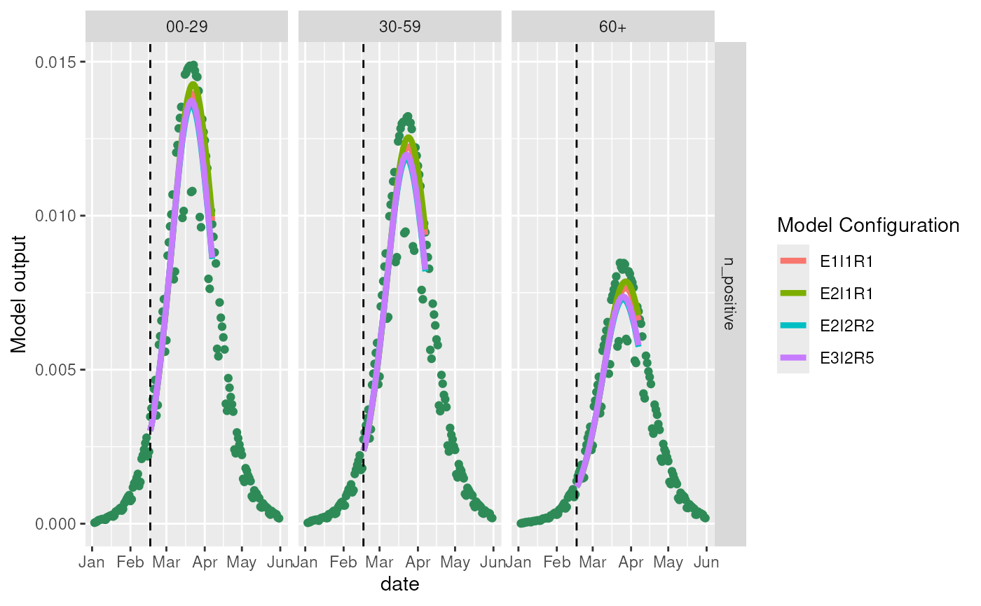
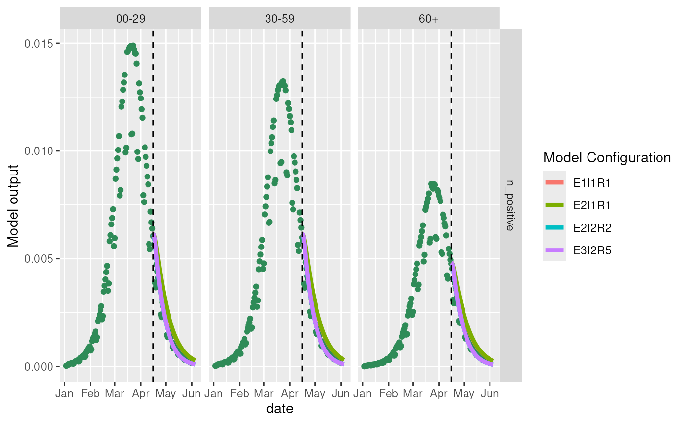
Misspecified model in periods of decreasing infections
models <- list(
  generate_model(2L, 1L, 1L),
  generate_model(1L, 1L, 2L),
  generate_model(2L, 2L, 2L),
  generate_model(3L, 2L, 5L)
)

# Update the last queryable date to later starting point
purrr::walk(models, \(m) {
  m$observables$set_last_queryable_date(
    m$observables$start_date + lubridate::days(150)
  )
})

predictions <- models |>
  purrr::map(\(m) {
    m$get_results(
      "incidence",
      stratification = rlang::quos(variant, age_group),
      prediction_length = 100
    ) |>
      dplyr::mutate(
        model_configuration = paste0(
          names(m$parameters$compartment_structure),
          m$parameters$compartment_structure,
          collapse = ""
        )
      )
  }) |>
  purrr::reduce(rbind)


ggplot2::ggplot() +
  ggplot2::geom_point(
    data = incidence_data,
    ggplot2::aes(x = date, y = incidence),
    color = switch(
      source,
      "n_infected"        = "deepskyblue3",
      "n_positive_simple" = "orange",
      "n_positive"        = "seagreen"
    )
  ) +
  ggplot2::geom_line(
    data = predictions,
    ggplot2::aes(x = date, y = incidence, color = model_configuration),
    linewidth = 1.5
  ) +
  ggplot2::geom_vline(
    xintercept = models[[1]]$observables$last_queryable_date,
    linetype = 2,
    color = "black"
  ) +
  ggplot2::facet_grid(source ~ age_group, scales = "free") +
  ggplot2::labs(y = "Model output", color = "Model Configuration")